Data visualization is often useful to find hidden patterns
and trends in data, to visualize and understand the results of
analytical models, and to communicate analytics to the public. It is
defined as a mapping of data properties to visual properties. Data
properties are usually numerical or categorical, like the mean of a
variable, the maximum value of a variable, or the number of
observations with a certain property. Visual properties are attributes
like (x, y) coordinates, colors, sizes, or shapes. Both types of
properties can be useful for understanding a dataset.
There are many different visualizations that can be created to understand and interpret data. Here are some examples, which we show how to create in ggplot below:
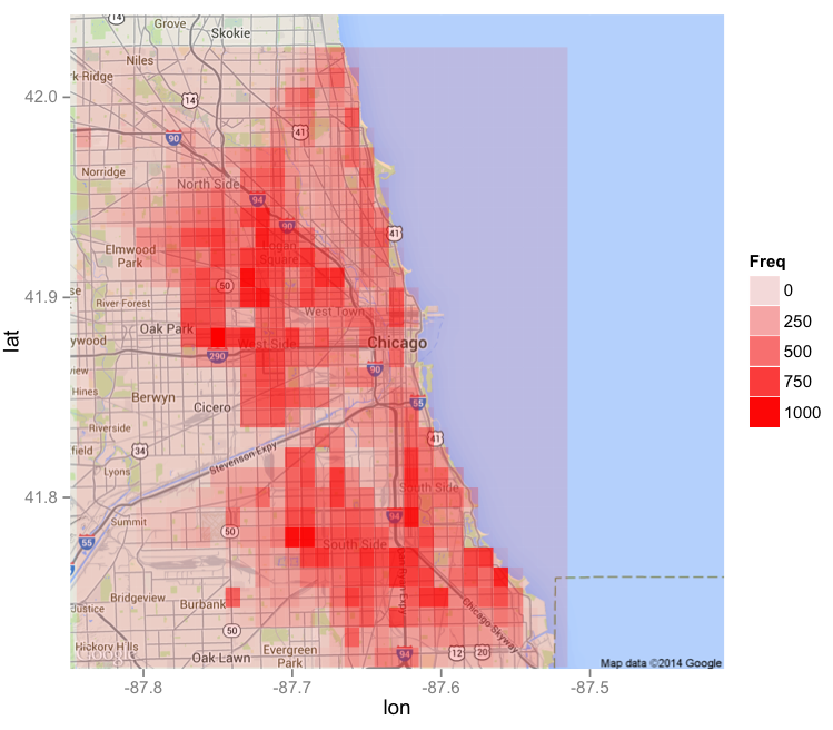
Alternatively, we could draw a heatmap on a geographical map, shown in the figure below. Here the grid attributes are longitude and latitude, and the squares in the grid are shaded according to the amount of crime in that area.
Scatterplots and Line Plots. Suppose we have a data frame called "Dataset", and we want to plot the data according to the attributes "Variable1" and "Variable2". We can make a basic scatterplot with the following command:
We can uniformly change the color, shape, and size of the points by adding arguments to geom_point, and add a title to the plot by adding ggtitle:
Alternatively, we can create a line plot with the following command:
Heat maps. Now suppose we want to create a heat map with the attributes "Variable1" and "Variable2" defining the grid, and then shade it according to the variable "Frequency". We can do this with the following command:
We can change the color scheme to range from white to red with the following command:
To create a heat map on the map of a city, we can use the "maps" and "ggmap" packages. The following commands create a red heat map on a map of Chicago, assuming that we have a dataset called "Dataset" with variables "Longitude", "Latitude" and "Counts":
United States map. To create a map of the United States with the states colored according to some attribute, we can use the following commands. Here we are assuming that our dataset is called "Dataset", it contains a variable called "region" with the names of the states in lowercase letters, and we want to color the states by "Variable1".
If we want to change the color scheme to range from white to red, we can do that with the following ggplot command:
There are many different visualizations that can be created to understand and interpret data. Here are some examples, which we show how to create in ggplot below:
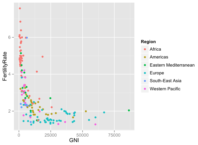
- Scatterplots. A scatterplot can often be the cleanest and most understandable visualization. It plots data as points in two dimensions, with one variable on the x-axis and one variable on the y-axis. By changing the color, shape, or size of the points according to another variable, additional dimensions can be added. Here is an example of a scatterplot, which compares Gross National Income (GNI) to Fertility Rate for countries:
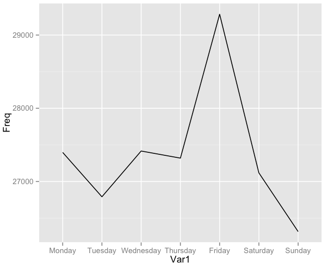
- Line plots. A line plot is often useful for visualizing data with a time component. Like scatterplots, a line plot can show multiple dimensions by changing the color or type of the lines. For example, the following plot shows the number of motor vehicle thefts in the city of Chicago by day of the week:
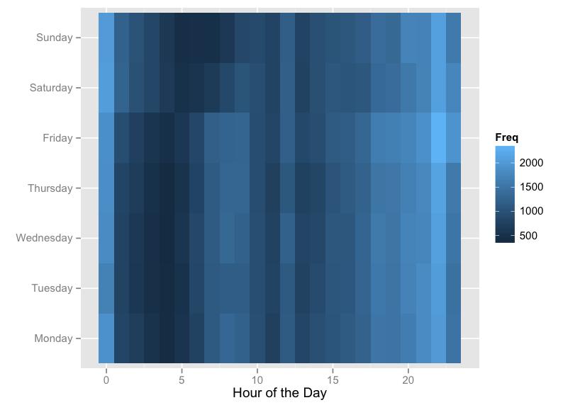
- Heat Maps. A great way to visualize frequency data on two attributes (like the frequency of crime according to the day of the week and the hour of the day, shown in the heat map below) is by using a heat map. A heat map creates a grid in two dimensions, with one attribute on the x-axis and the other on the y-axis. There is a square in the grid for every possible pair of the two attributes. For example, in the following plot, we have 7*24 = 168 squares in the grid, one for each hour of each day. Then the squares are shaded according to the frequency attribute.
Alternatively, we could draw a heatmap on a geographical map, shown in the figure below. Here the grid attributes are longitude and latitude, and the squares in the grid are shaded according to the amount of crime in that area.
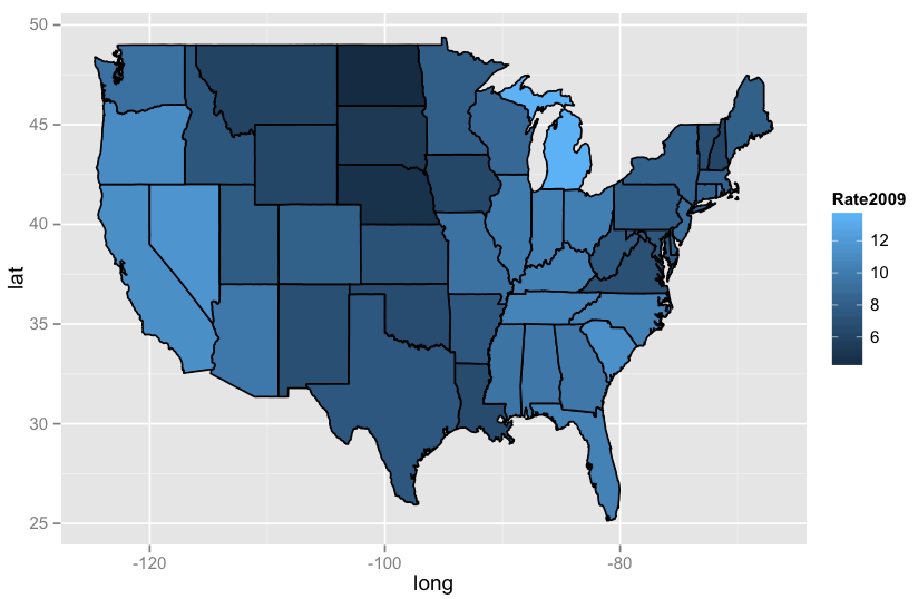
- Geographical Maps. A common visualization used by organizations like the Centers for Disease Control (CDC) and the World Health Organization (WHO) is a country or world map, with the different states or countries colored according to some attribute, like obesity, high school graduation, or unemployment. The following visualization shows an unemployment map of the United States from 2009, during the peak of the Great Recession.
Visualizations in R
Great visualizations can be created in R using the "ggplot2" package.Scatterplots and Line Plots. Suppose we have a data frame called "Dataset", and we want to plot the data according to the attributes "Variable1" and "Variable2". We can make a basic scatterplot with the following command:
ggplot(Dataset, aes(x = Variable1, y = Variable2)) + geom_point()
We can uniformly change the color, shape, and size of the points by adding arguments to geom_point, and add a title to the plot by adding ggtitle:
ggplot(Dataset, aes(x = Variable1, y = Variable2)) + geom_point(color="blue", shape=17, size=2)
ggplot(Dataset, aes(x = Variable1, y = Variable2)) + geom_point(color="darkred", shape=8, size=5) + ggtitle("Our Basic Scatterplot")
ggplot(Dataset, aes(x = Variable1, y = Variable2, color = Variable3)) + geom_point()
Alternatively, we can create a line plot with the following command:
ggplot(Dataset, aes(x = Variable1, y = Variable2)) + geom_line()
Heat maps. Now suppose we want to create a heat map with the attributes "Variable1" and "Variable2" defining the grid, and then shade it according to the variable "Frequency". We can do this with the following command:
ggplot(Dataset, aes(x = Variable1, y = Variable2)) + geom_tile(aes(fill = Frequency))
We can change the color scheme to range from white to red with the following command:
ggplot(Dataset, aes(x = Variable1, y = Variable2)) + geom_tile(aes(fill = Frequency)) + scale_fill_gradient(low="white", high="red")
To create a heat map on the map of a city, we can use the "maps" and "ggmap" packages. The following commands create a red heat map on a map of Chicago, assuming that we have a dataset called "Dataset" with variables "Longitude", "Latitude" and "Counts":
chicago = get_map(location = "chicago", zoom = 11)
ggmap(chicago) + geom_tile(data = Dataset, aes(x = Longitude, y = Latitude, alpha = Counts), fill="red")
United States map. To create a map of the United States with the states colored according to some attribute, we can use the following commands. Here we are assuming that our dataset is called "Dataset", it contains a variable called "region" with the names of the states in lowercase letters, and we want to color the states by "Variable1".
statesMap = map_data("state")
MergedData = merge(statesMap, Dataset, by="region")
ggplot(MergedData, aes(x = long, y = lat, group = group, fill = Variable1)) + geom_polygon(color = "black")
If we want to change the color scheme to range from white to red, we can do that with the following ggplot command:
ggplot(MergedData, aes(x = long, y = lat, group = group, fill = Variable1)) + geom_polygon(color = "black") + scale_fill_gradient(low = "white", high = "red")
No comments:
Post a Comment